The Apple event on the 21st of March presented a small handful of incremental changes to the iPhone, iPad, Apple Watch, and Apple TV. But besides the iPhone 7, one of the largest outstanding questions remains where is the Mac going, what’s next, and when?
OS X. Released in 2001, still around 15 years later. While the design has morphed from Aqua to a strange Aqua/Leather abomination to the flat-ish design of Yosemite/El Cap, and the feature set has evolved to include the App Store, Continuity, and more, the core of OS X is largely the same as it was on day one. This isn’t entirely a bad thing– the operating system has been solid and consistent compared to the alternative, a Windows that has continuously wavered and seemingly dropped all efforts to provide a sense of cohesiveness to its users. But as the years go by the chatter picks up. What is the future of OS X? Will it converge with iOS? What level of innovation can we expect for the Mac? Through the debates that continue to amplify, it is becoming quite clear: after years of Mac evolution, it’s time for a revolution.
The Name
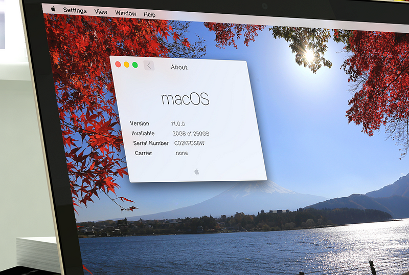
Every WWDC for the past many years, Apple has revealed a new version of OS X, iOS, and recently watchOS. iOS and watchOS are incremented by a whole number every year, while the Mac continues to get point releases. In addition we’ve seen a new naming convention emerge– iOS, watchOS, and tvOS share a format that OS X has yet to adopt. For these two reasons, it seems logical that the next major incarnation of the Mac operating systems adopts the name macOS with version number 11.0.
On Convergence
Convergence of operating systems is a very good thing, as long as we’re specific about what convergence means and how it’s done. In the past few years we’ve seen different convergence techniques. On one end, Microsoft’s unification of Windows across platforms has attempted to bring a common, scalable UI to all platforms with an implementation that has been widely regarded as hasty, messy, and poorly designed. Apple’s approach has taken longer but in typical fashion pays attention to vital nuance. iOS, watchOS, and tvOS share the same underlying OS, frameworks, and UI model but optimize their presentation for the current form and input. It’s a solution that provides developers with a common platform but doesn’t force compromise for the end user experience. The Mac has been mostly left out.
Common Threads
With the release of macOS should come innovation that positions the OS for the next decade of innovation, and it’s all about common threads that run through the ecosystem. Specifically, macOS 11 should introduce a common framework for presentation, a brand new model for content, and a common thread for people.
UIKit: A common framework for presentation
watchOS and tvOS have demonstrated that UIKit can be both consistent and versatile, and many Mac developers have been clamoring for a friendlier app framework for years. On iOS we’re used to using native apps for just about everything, yet on OS X, much of the same services are only available as web apps. While they don’t suffer from the same performance degradation as the mobile web (or at least the old mobile web), does it really make sense that so many of us keep open 10 tabs for the services we use most? The browser is really a terrible window manager. But of course, developers haven’t wanted to build their apps for yet another platform, so web apps have been simply good enough.
Right now, I really believe that OS X is a dead platform. It’s been coasting on iOS’ wake for years, picking up features often long after they’ve been implemented on iOS. Apple needs to create a unified app platform between the two OSes. This doesn’t mean a desktop would just run iOS apps, much like tvOS doesn’t ‘just run’ iOS apps. The same ideas should apply: a shared codebase, with minor platform-specific elements, and an optimized UI for the OS’ primary interaction model. — @stroughtonsmith
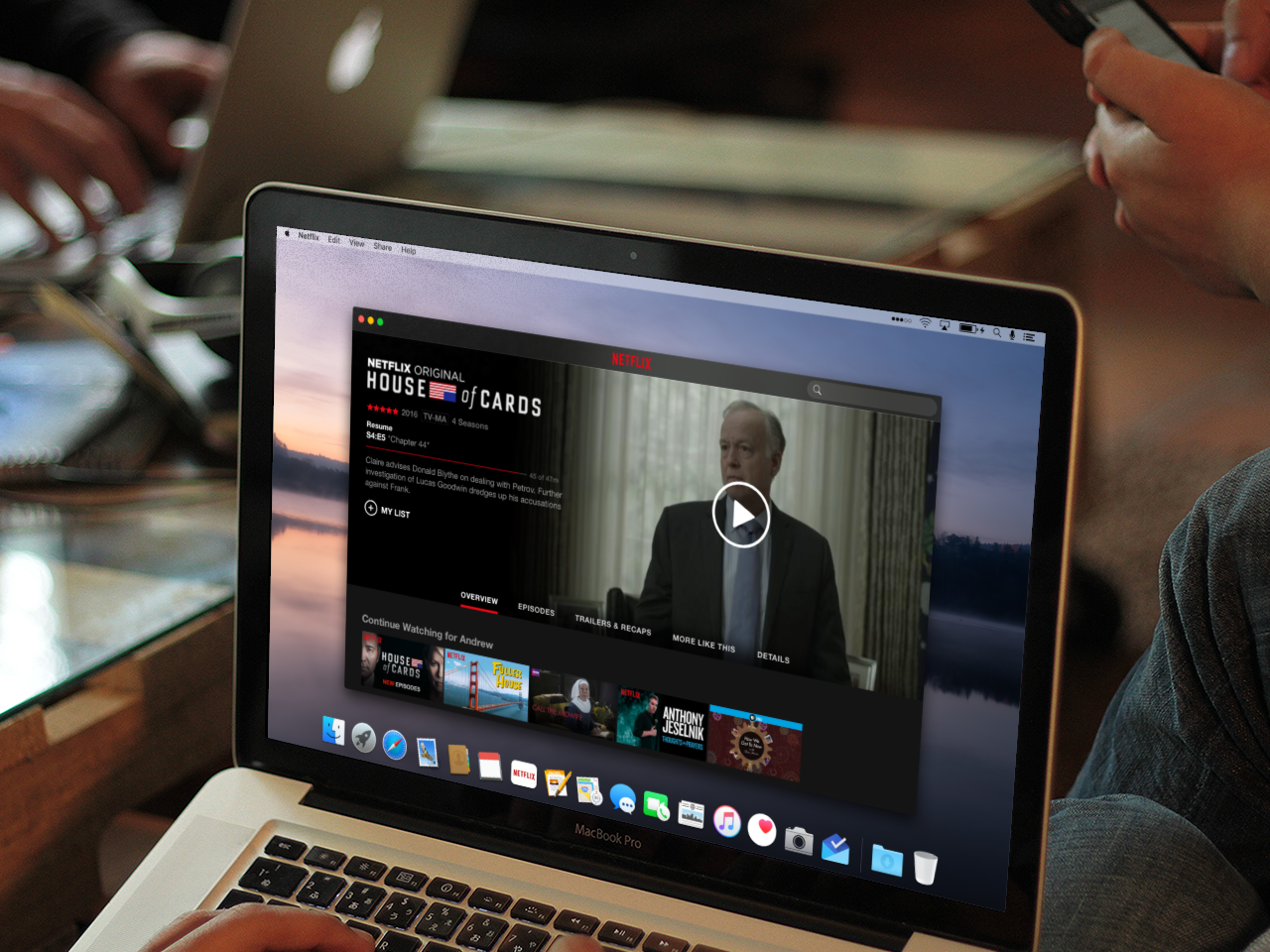
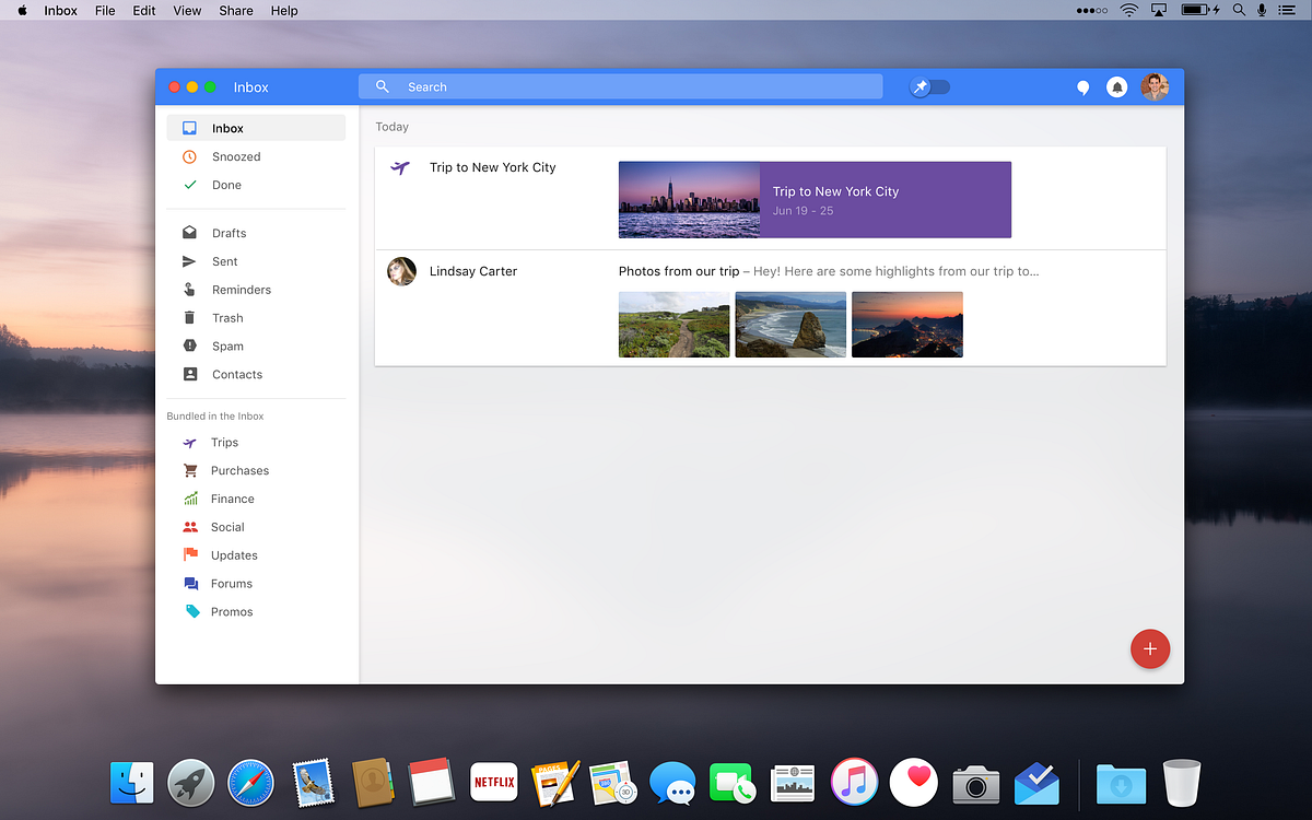
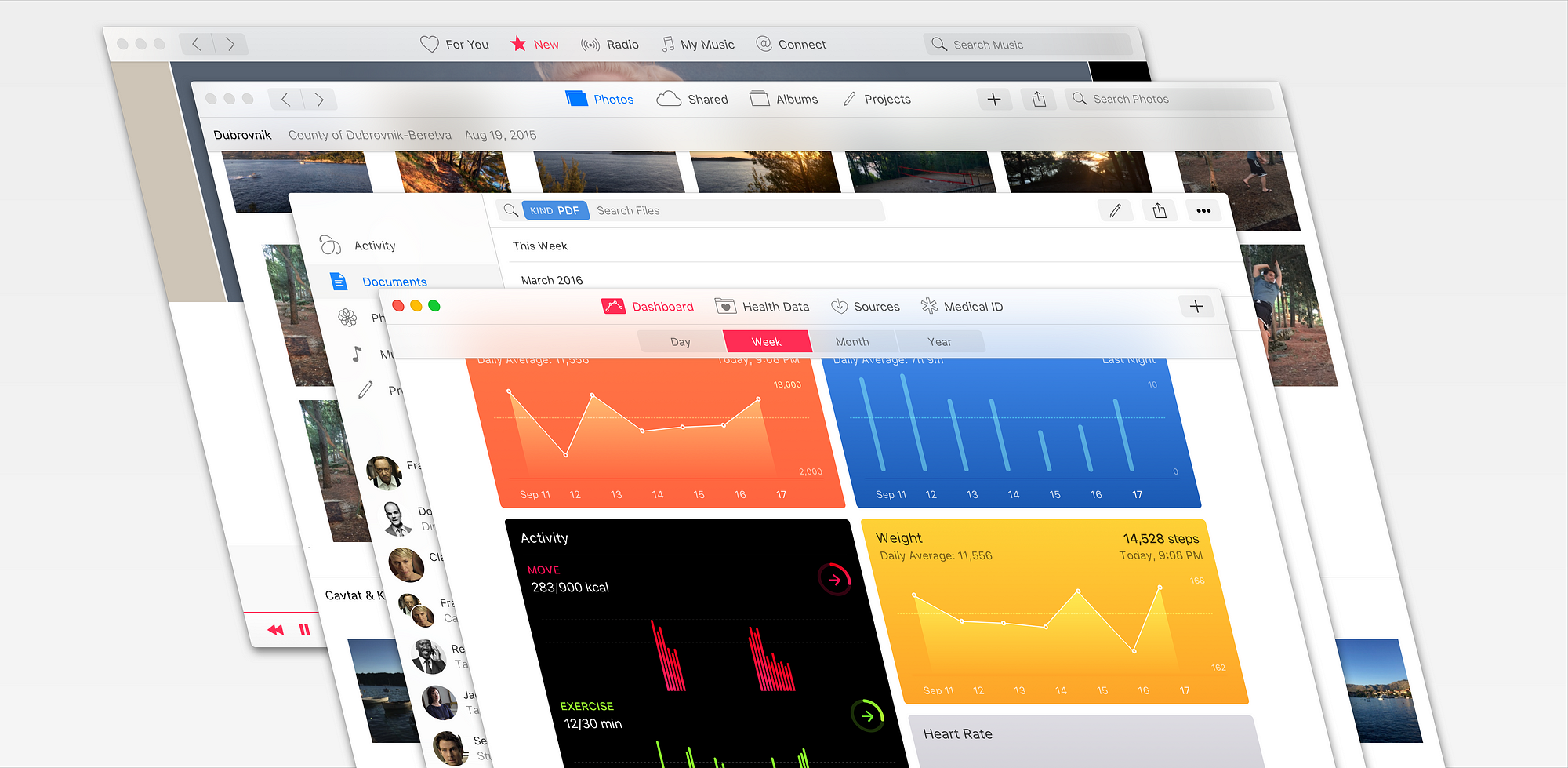
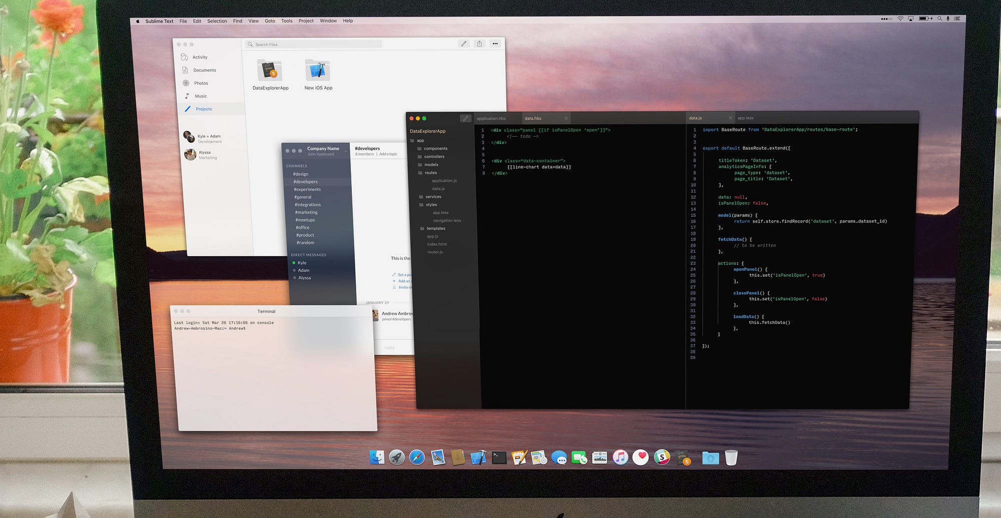
With the introduction of UIKit apps on macOS, apps like Facebook, Netflix, and Inbox would easily port with few modifications and take advantage of native performance, window management, notifications, offline support, and every new feature brought to the OS.
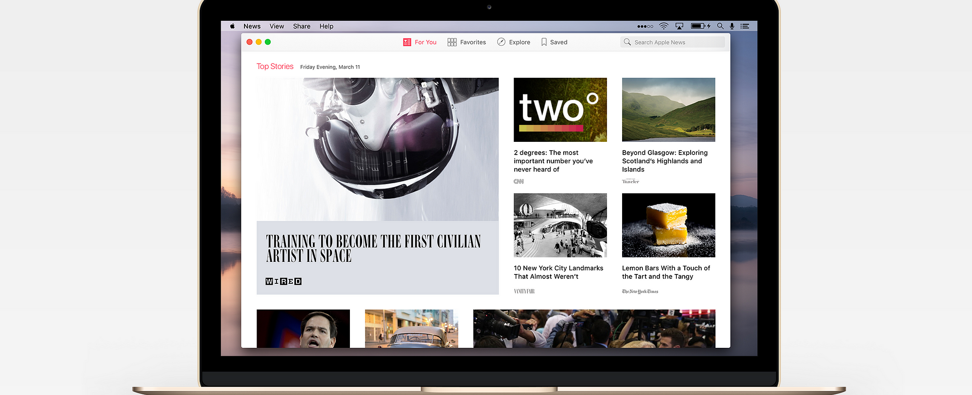
Not only would many third party apps come to the Mac, but Apple apps that have been only available on iOS could make the jump, like News and Health. For years, Apple has lived by the “Back to the Mac” strategy, but UIKit for macOS would allow the platforms to grow together. However, it would not at all decrease the power available to pro apps, one bit. Let’s take a look:


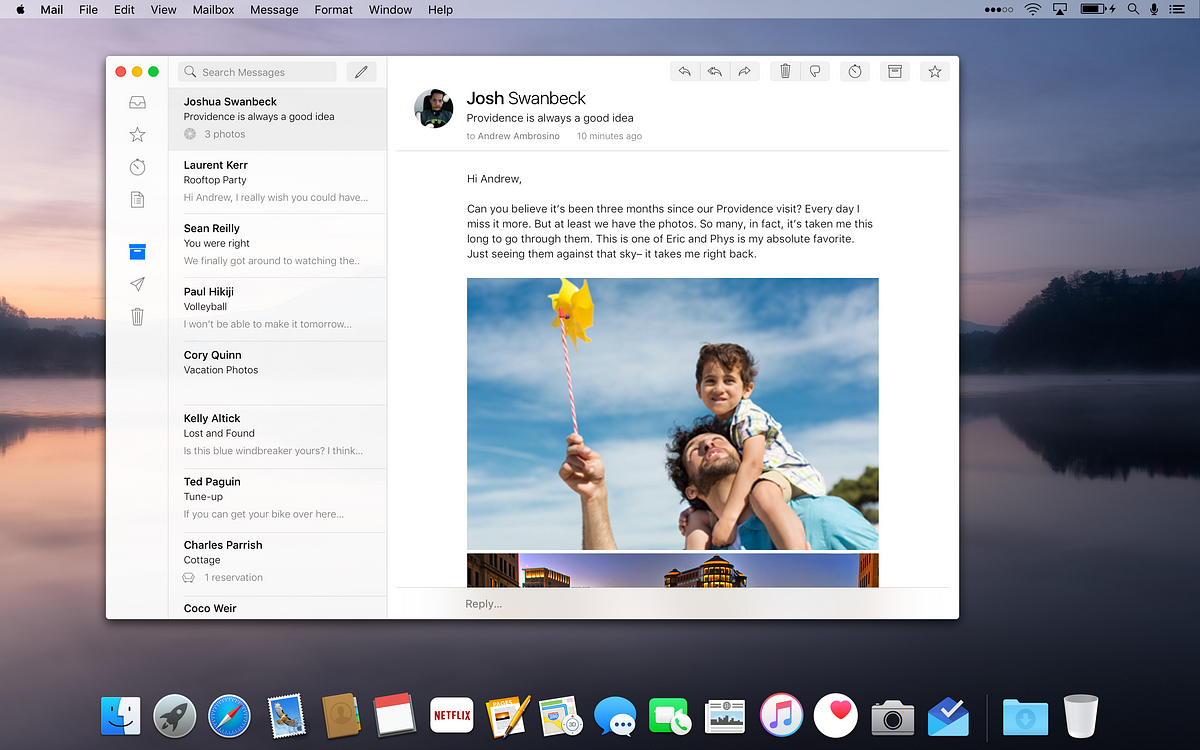
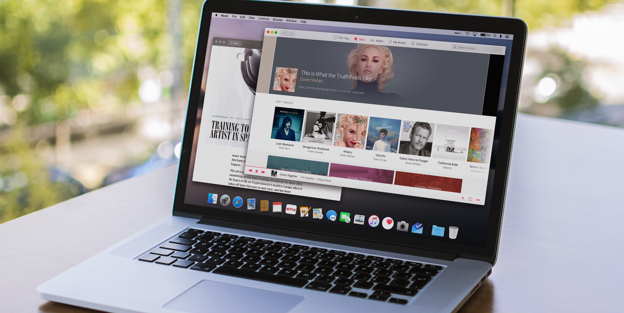
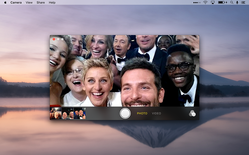
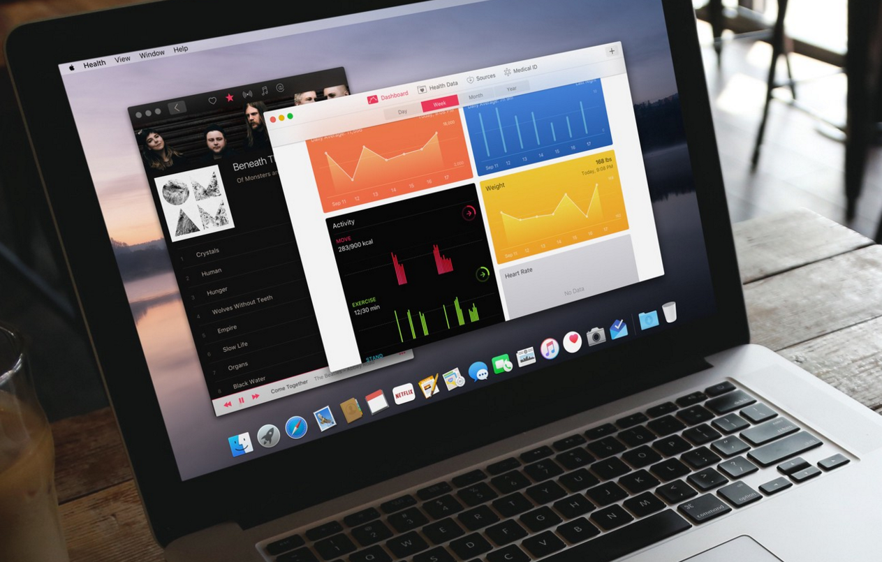
FS: A brand new model for content
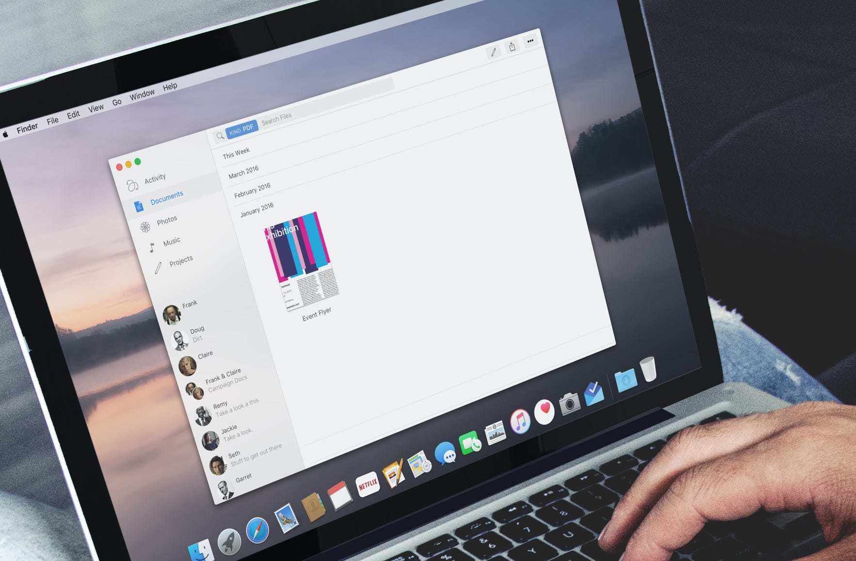
Last year I had the privilege of working at Upthere (if you haven’t seen what they’re doing, go take a look). Started by Bertrand Serlet and others a few years ago, the goal has been to introduce a brand new stack that forms a cloud filesystem and model for organizing content. The model is simple and the implementation complex– it lacks hierarchy and relies on powerful search and self-organization, along with building in sharing and collaboration into the filesystem itself. It’s about time for macOS to shift to this type of organization (or just buy them!).
Upthere leaves behind the hierarchical folder structures found in today’s devices and cloud storage services. Instead, Upthere stores all your stuff in a single bucket, relying on search to retrieve and display information. This approach allows for more flexibility and control without needlessly duplicating your things. Loops are a tool for grouping things into photo albums, music playlists, projects, or anything else that comes to mind. Things can be part of multiple Loops at the same time, so you are not bound by one rigid structure. –Upthere
We produce far too much content and our work is too often collaborative to rely on a manual model that was designed many, many years ago.
The People Thread
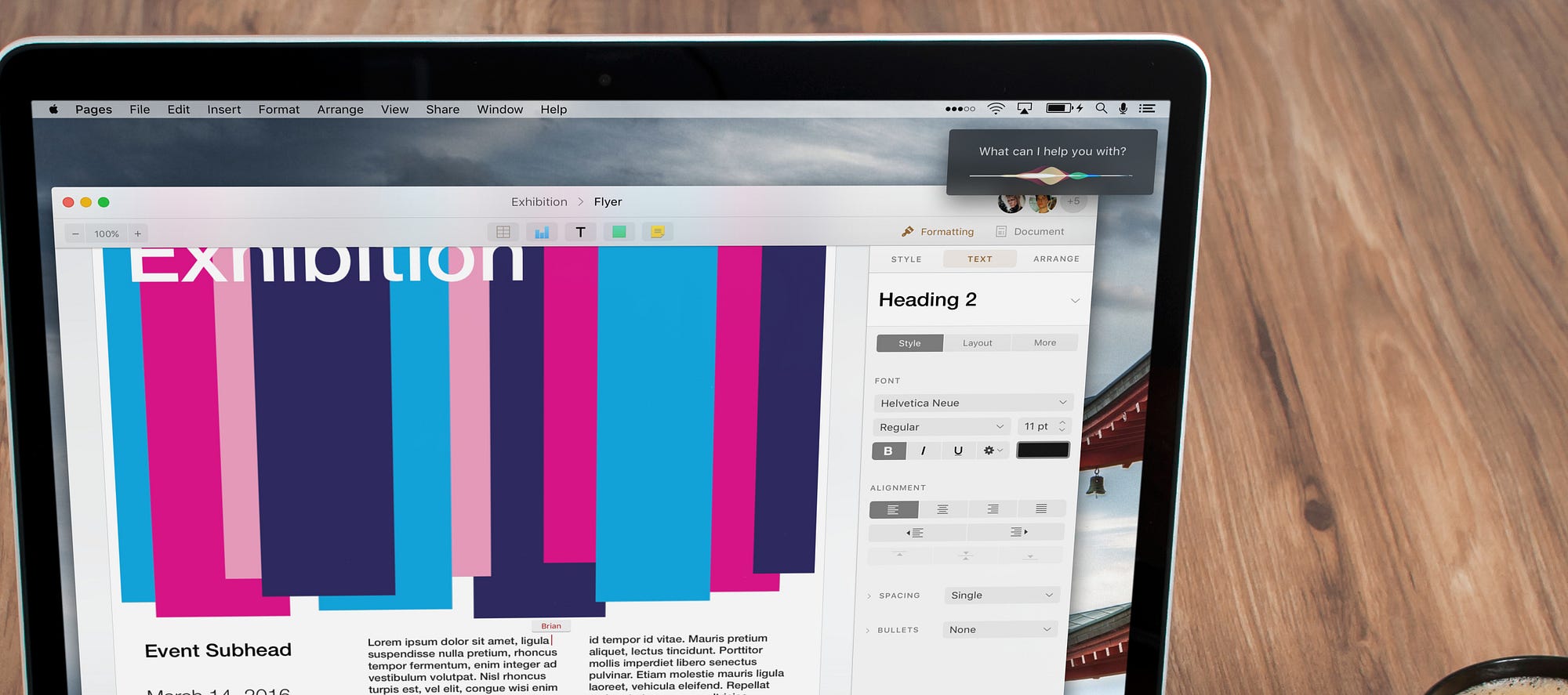
As platforms like Google and Facebook have created a cohesive organization of people/identity that has allowed them to easily interact and collaborate, Apple has begun to feel dated. As the operating system on which these other platforms often run, OS X and iOS have an opportunity to create an advanced common thread for people. This means tying together mail, messages, shared photo albums, files, and playlists into one model, one history, one closed loop. Again, this is something that Upthere has made first-class in its filesystem and apps.
Facebook lays this out specifically:
Social design is a product strategy that builds upon users’ trusted communities, encourages conversation between them and ultimately creates a stronger sense of identity for everyone. By putting people at the center of the Web, more and more experiences that naturally happen in the real world are starting to happen online.— Facebook

Putting it all together
When these three new developments materialize– UIKit, a new Filesystem, and a new model for people– there will be an explosion in next-generation apps across the ecosystem. This ecosystem, now drawn tightly together, will be a collection of four purpose-built operating system variants built on one common, advanced platform, one best described as Apple OS.
It’s time.
(shout out to Sketch for making this easy to tackle in 3 days)
Update: it’s worth noting that there isn’t actually baby-ification going on here. There is absolutely no reason for Terminal, Xcode, etc. to leave. After all, how would we be building these apps? (my background is software engineering, btw). This is also not about bringing iOS to the desktop. It’s about common threads that allow them to grow together. But to each their own.




Graphic designers – Why do they always want to dumb everything down so everybody will be forced to “admire” their empty eye candy. Pathetic.
The sentences above are filled with jargon and pretension. We don’t need a computer to give us identity or meaning in our lives.
The only reason the Mac and its OS “feel dated” is because you have the emotional attention span of a goldfish. Sorry, no offense intended. Do we need to improve the flight of an osprey, or reconceive the gait of a stallion? NO, we don’t, because they are fully refined and completely fit for purpose. That should be the goal of Mac OS and app designers. To build refined tools that stand the test of time, by efficiently suiting their purpose.
We don’t need or want anyone “tying together all our data into one closed loop”. Apple should run far, far away from anyone that encourages them to be more like Google and Facebook. What a ghastly hell on earth!
AA needs to unplug himself, and go take a long, long walk in the woods.
I’m sure the author is a fine fellow and kind to old ladies and stray kittens, but ….
Why do graphic designers always want to visually dumb everything down so everybody will be forced to “admire” their empty eye candy. Pathetic.
The sentences above supporting the pictures are filled with jargon and pretension. We don’t need a computer to give us identity or meaning in our lives.
The only reason the Mac and its OS “feel dated” is because some people have the emotional attention span of a goldfish. Sorry, no offense intended. Do we need to improve the flight of an osprey, or reconceive the gait of a stallion? NO, we don’t, because they are fully refined and completely fit for purpose. That should be the goal of Mac OS interface and app designers. To build refined tools that stand the test of time, by efficiently suiting their purpose.
We don’t need or want anyone “tying together all our data into one closed loop”. Apple should run far, far away from anyone that encourages them to be more like Google and Facebook. What a ghastly hell on earth!
AA needs to unplug himself, and go take a long, _long_ walk in the woods.
Fluff and nonsense. Use your computer to do work.
aww, we thought computer is only for games 😀